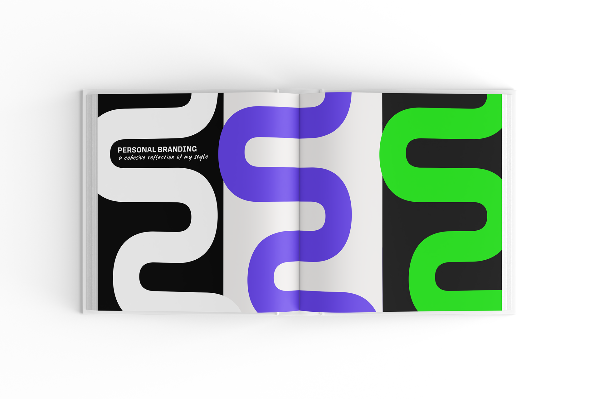
Creating my personal brand was one of the most challenging projects I’ve taken on. I wanted a visual identity that felt authentic — something that reflected both my name and my approach to design. After exploring a range of ideas, I developed a concept based on symmetry, inspired by the fact that “Hannah” is a palindrome.
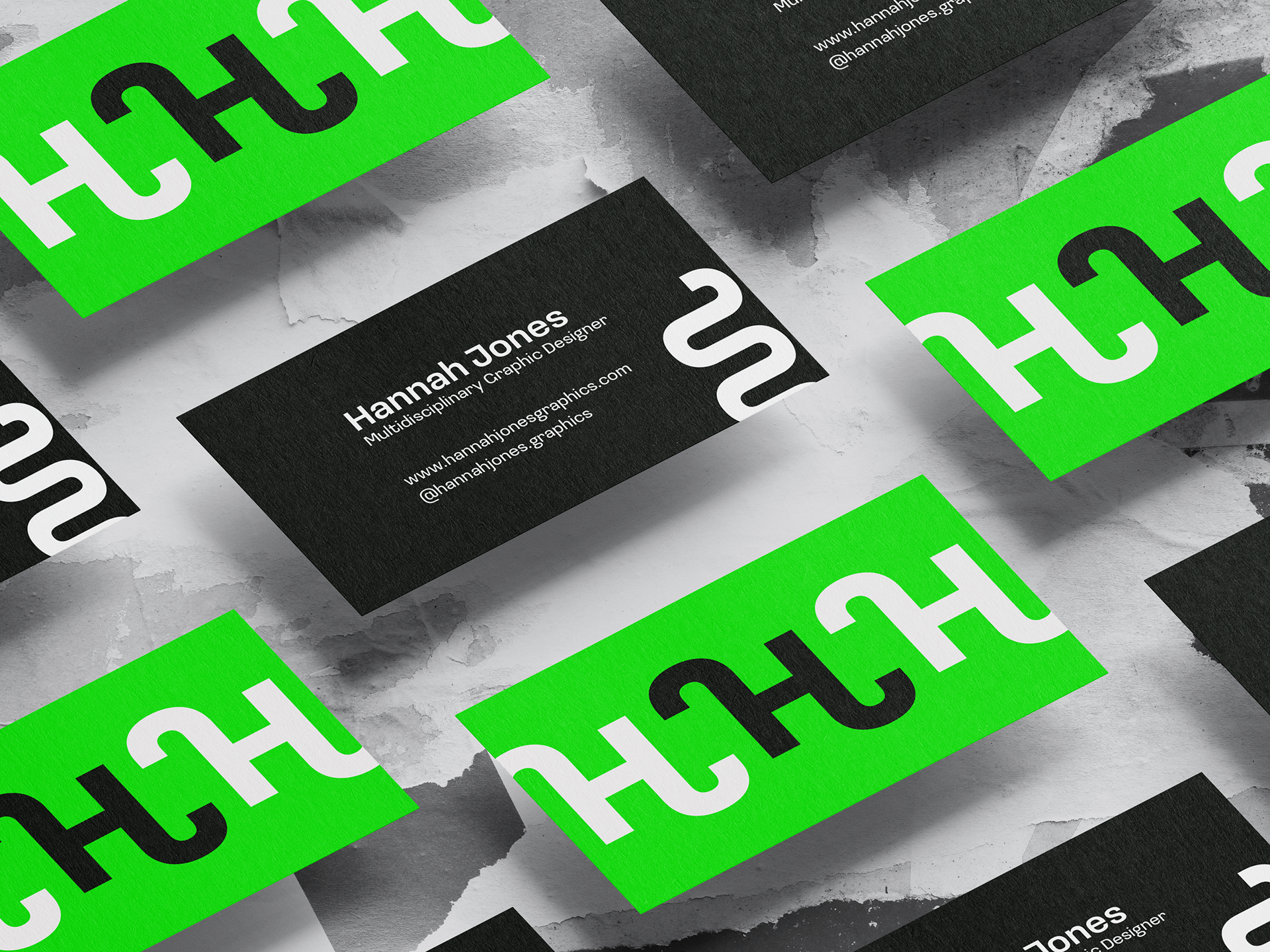
This led me to focus on the mirrored forms of my initials, H and J, and create a minimal symbol that captured balance and personal identity. Rather than relying on a complex logo, I chose a clean, adaptable mark that supports my broader design language, which often features texture, vibrant colour, and fine detail.
The final identity includes a custom symbol and a flexible set of visual assets that reflect how I work — with intention, clarity, and attention to form. This project reminded me that branding isn't just about a logo, but about how every element works together to express who you are as a designer.